Tailwind Flex box Basics: A Comprehensive Guide

Understand the power of Tailwind CSS Flexbox with this comprehensive guide. It is designed to help you understand and utilize flex properties for efficient and responsive layouts.
In this article, we will dive deep into utility classes, explore flex directions, and discover the intricacies of spacing, alignment, and ordering.
What is Flex?
Flex, also known as flexbox, is one of the display property values. A one-dimensional layout method that arranges items in rows or columns and is used to specify the space between or around a group of items. It is designed to achieve alignment and space distribution along a particular row or column direction.
Learn more about the Flexbox concept below:
Tailwind Flex Utility Classes
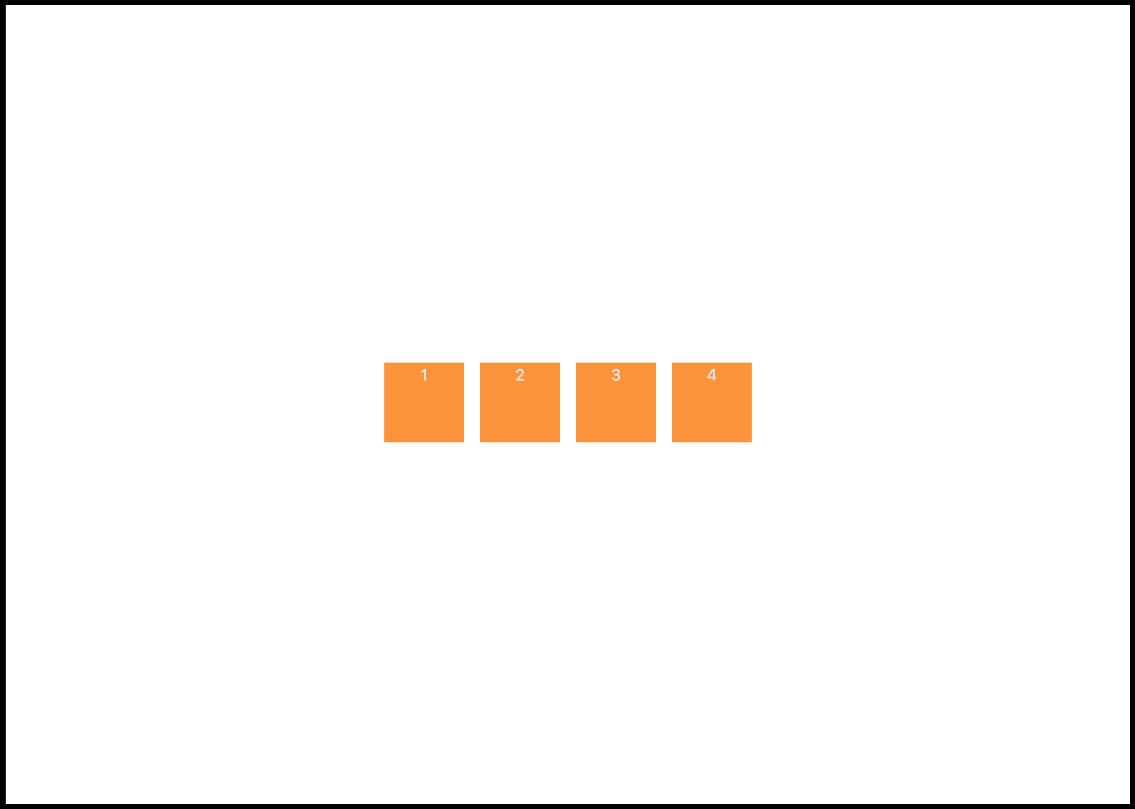
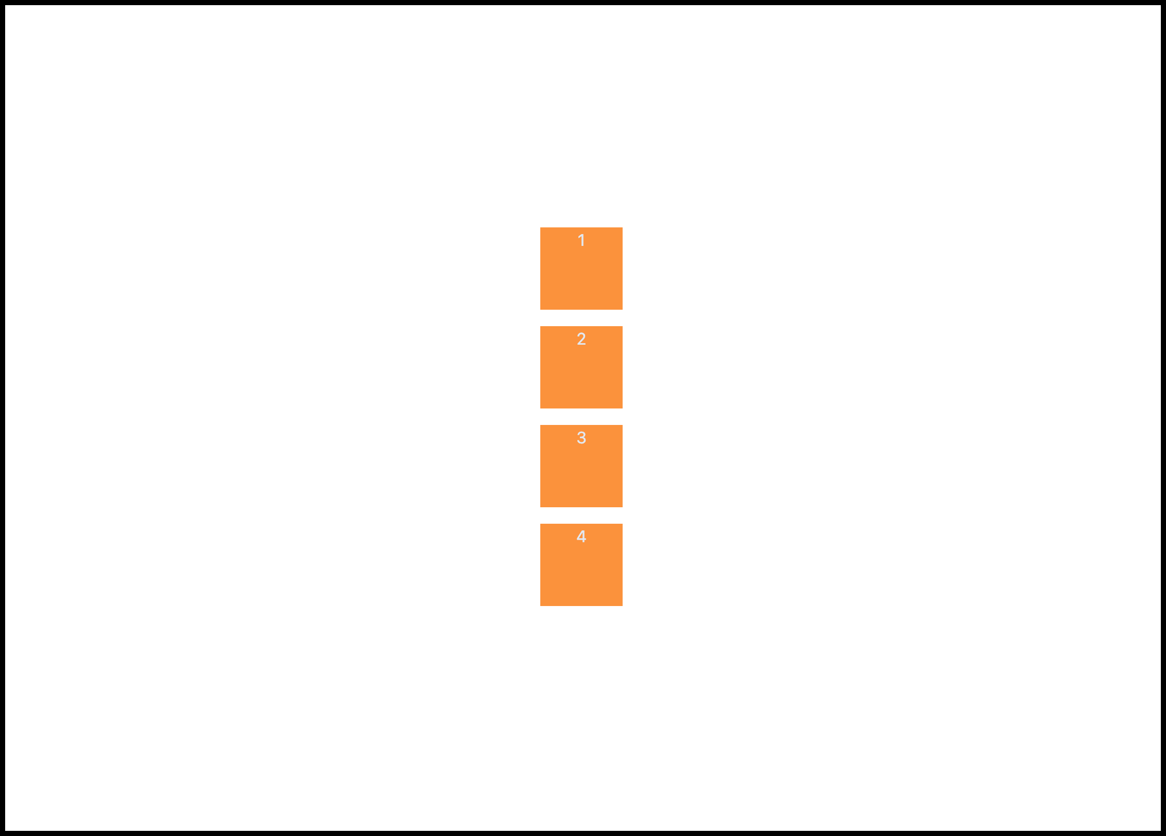
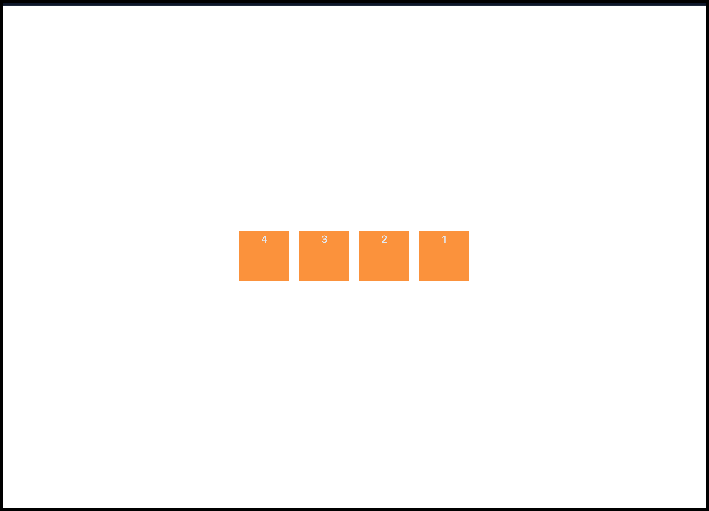
Given that we have a div element with four children/items as shown below:
<div>
  <div class="h-20 w-20 bg-orange-400 text-center text-slate-200">1</div>
  <div class="h-20 w-20 bg-orange-400 text-center text-slate-200">2</div>
  <div class="h-20 w-20 bg-orange-400 text-center text-slate-200">3</div>
  <div class="h-20 w-20 bg-orange-400 text-center text-slate-200">4</div>
</div>
The output is as follows.
Flex
We use the flex utility class to apply the flex display property to an element or container in Tailwind CSS. By default, the children of an element are aligned horizontally when flex is applied as demonstrated below:
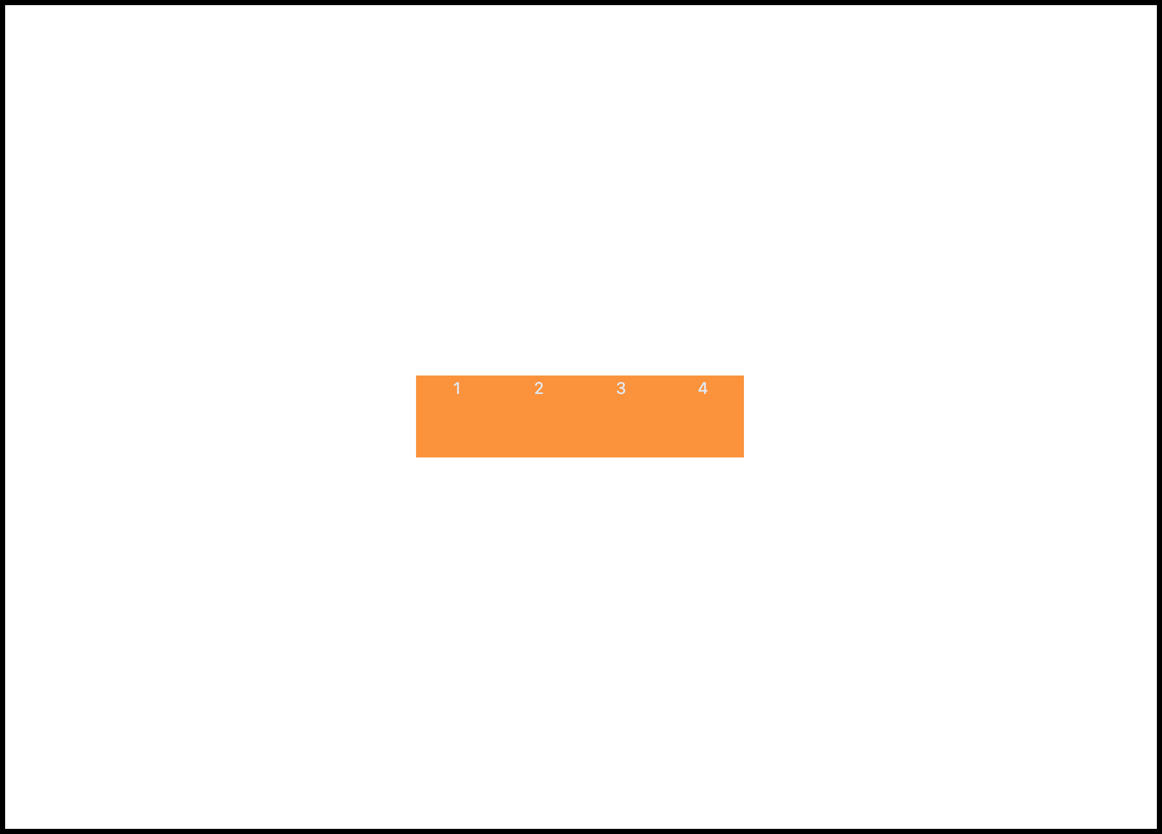
Gap
The Tailwind gap property is used to apply space or gutter between the children of a flex container/element. We can apply a gap of 1rem (16px) using the Tailwind gap-4 utility class name.
<div class="flex gap-4">
  <div class="h-20 w-20 bg-orange-400 text-center text-slate-200">1</div>
  <div class="h-20 w-20 bg-orange-400 text-center text-slate-200">2</div>
  <div class="h-20 w-20 bg-orange-400 text-center text-slate-200">3</div>
  <div class="h-20 w-20 bg-orange-400 text-center text-slate-200">4</div>
</div>
This will give us the following output:
The gap utility classes can also be used horizontally (left to right) gap-x-{size} or vertically (top to bottom) using gap-y-{size}. We'll use these utility classes in the flex-direction section.
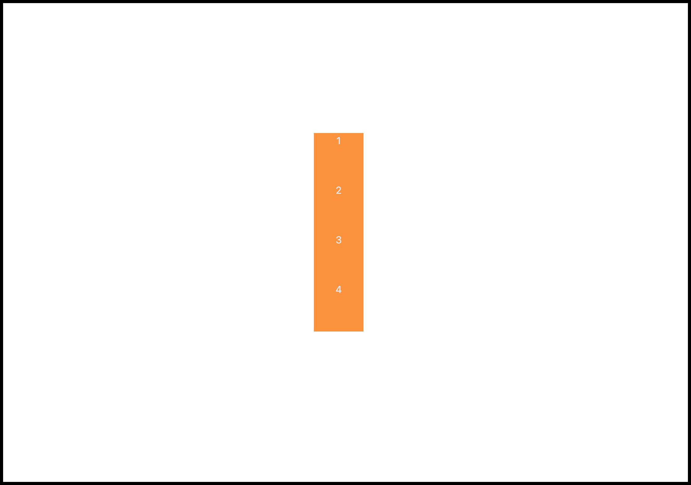
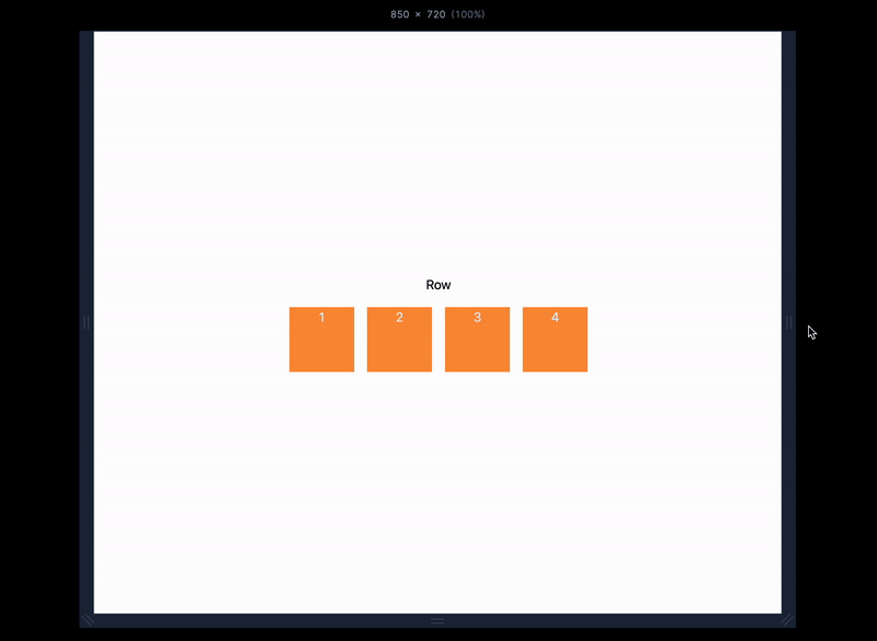
Spacing
Spacing is a utility class that can be used to apply spaces on child elements. This is similar to the gap utility class but works without applying flex on the parent element.
<div class="space-y-4">
  <div class="h-20 w-20 bg-orange-400 text-center text-slate-200">1</div>
  <div class="h-20 w-20 bg-orange-400 text-center text-slate-200">2</div>
  <div class="h-20 w-20 bg-orange-400 text-center text-slate-200">3</div>
  <div class="h-20 w-20 bg-orange-400 text-center text-slate-200">4</div>
</div>
This comes in handy when you want to space elements without the need to apply flex property on the parent container.
Flex Direction
There are a couple of directions that can be achieved in Flexbox on either a horizontal or vertical axis. Some of the common directions are:
Flex row
Flex row reverse
Flex column
Flow column reverse
1. Flex Row

This is the default direction of a flex container children where they are positioned horizontally on the same axis. This can be achieved manually by adding the flex-row utility class name to the flex container.
<div class="flex flex-row ...">...</div>
2. Flex Row Reverse
This is similar to the Row direction but the children are arranged in a reversed manner as shown below:
This is achieved by applying the flex-row-reverse utility class.
<div class="flex flex-row-reverse ...">...</div>
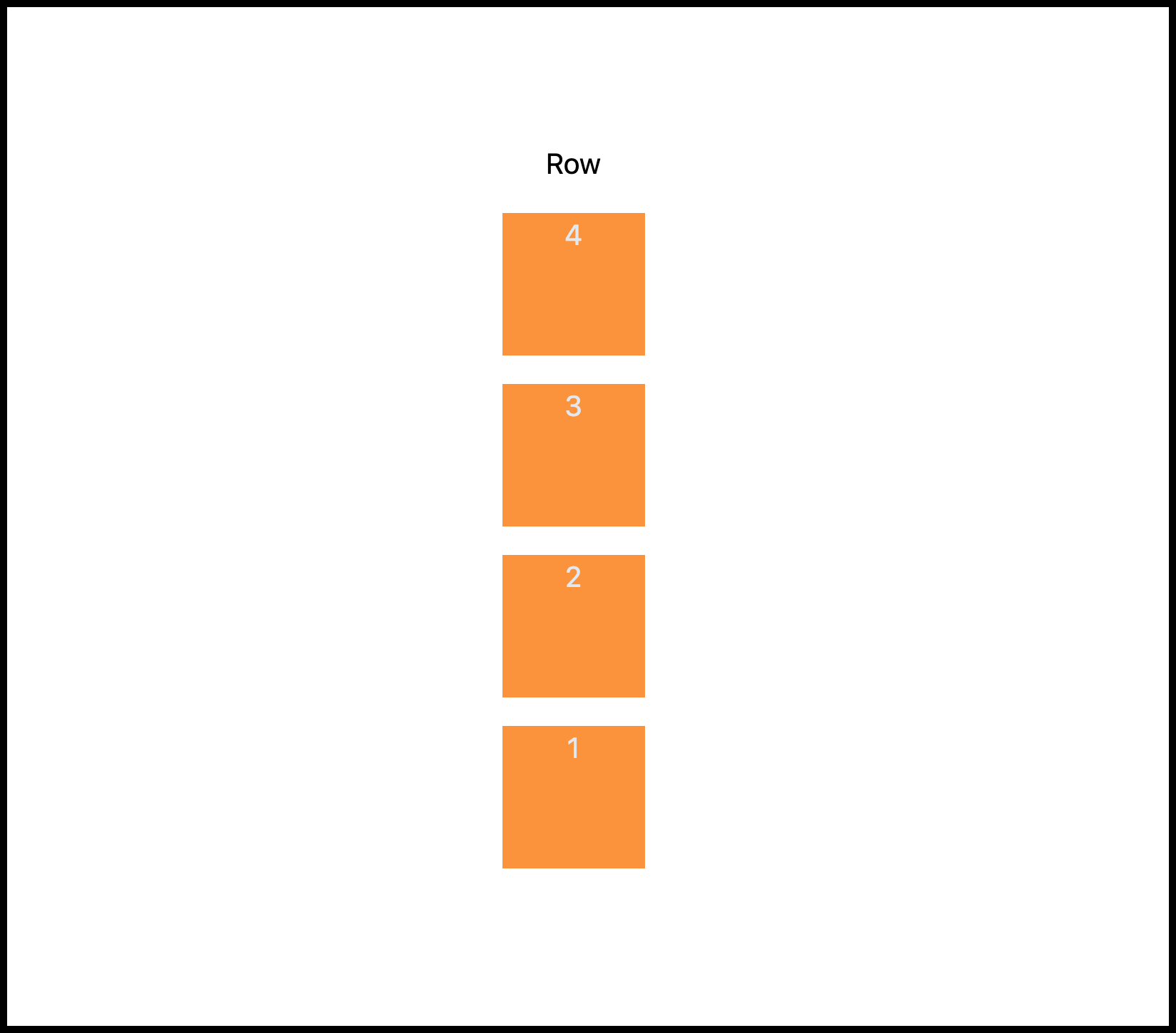
3. Flex Column
Use the flex-col to position the children in a flex container vertically. This is especially useful during design breakpoint and responsive design as demonstrated below.
4. Flex Column Reverse
Use the flex-col-reverse to position the children in a reverse vertical arrangement as shown below.
Flex Grow
Use the flex-grow or grow property class name when you want a child to take up the remaining space in its parent container as demonstrated below.
Source code:
<div class="w-full flex gap-4">
  <div class="h-20 w-20 bg-orange-400 text-center text-slate-200">1</div>
  <div class="h-20 grow bg-orange-400 text-center text-slate-200">2</div>
  <div class="h-20 w-20 bg-orange-400 text-center text-slate-200">3</div>
</div>
As shown in the code above, we didn't set the width of the child element we want to apply the grow property to because we want them to take the available spaces.
Flex Basis
Use the flex basis property class name to specify the default width size of flex items (children). You can read the difference between the flex-grow and basis property from here.
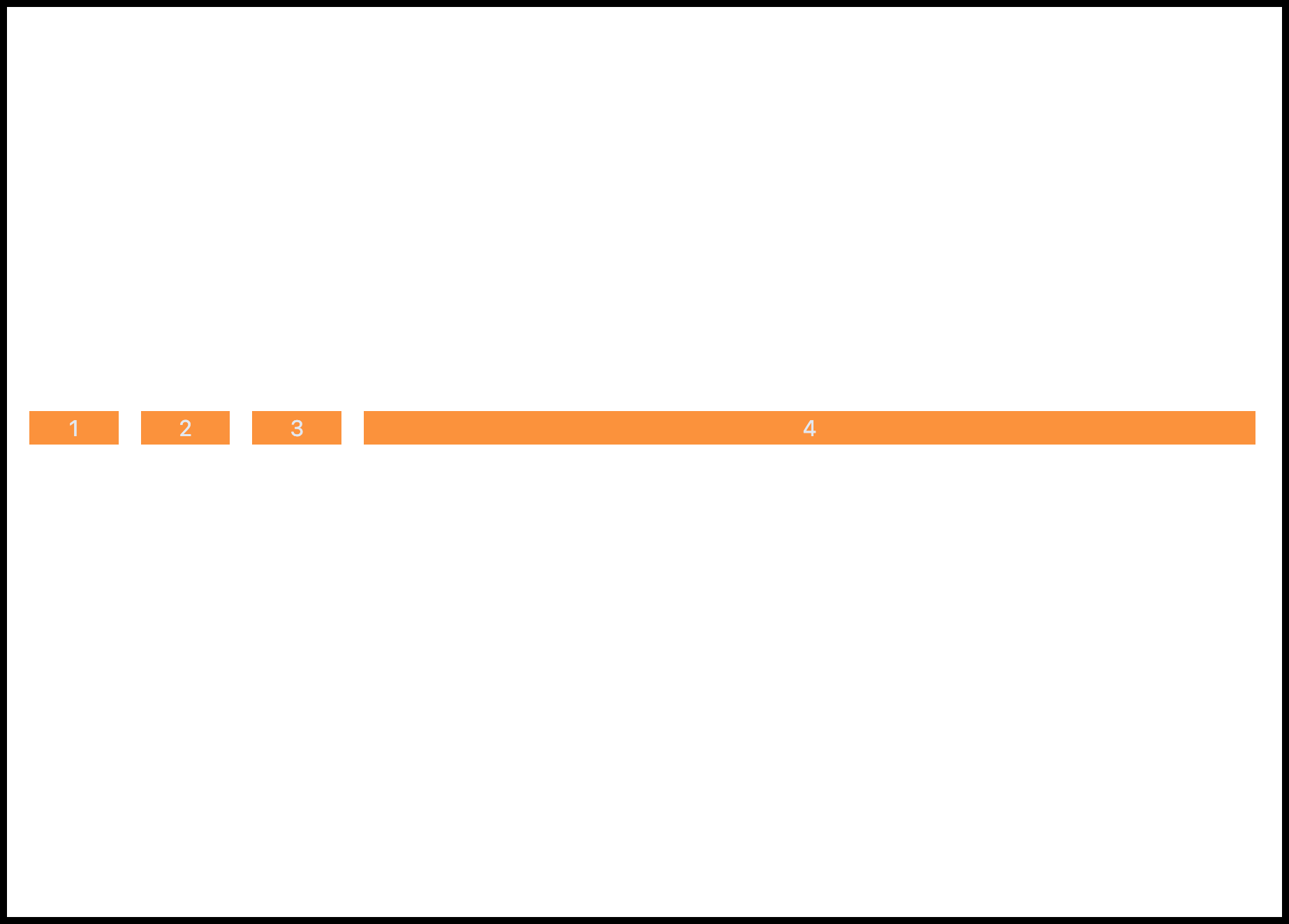
Source code:
  <div class="flex w-full gap-4">
    <div class="basis-1/12 bg-orange-400 text-center text-slate-200">1</div>
    <div class="basis-1/12 bg-orange-400 text-center text-slate-200">2</div>
    <div class="basis-1/12 bg-orange-400 text-center text-slate-200">3</div>
    <div class="basis-10/12 bg-orange-400 text-center text-slate-200">4</div>
  </div>
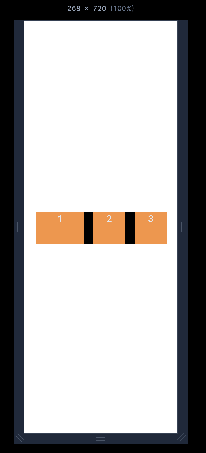
Flex Shrink
Use the shrink property to make flex items shrink or adjust their sizes when needed, or use the shrink-0 to prevent flex items from shrinking or adjusting.
With tailwind shrink property; shrink:
Without the tailwind shrink property; shrink-0.
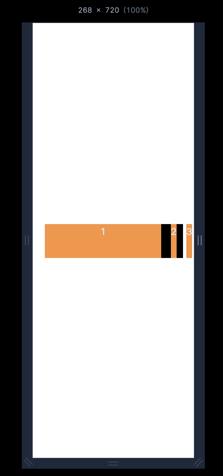
Source code:
<div class="flex w-full gap-4 bg-black">
  <div class="shrink-0 h-14 w-48 bg-orange-400 text-center text-slate-200">1</div>
  <div class="h-14 w-32 bg-orange-400 text-center text-slate-200">2</div>
  <div class="h-14 w-32 bg-orange-400 text-center text-slate-200">3</div>
</div>
Flex Wrap
Flex wrap is useful when you want the flex items to break to another line when it's needed for better responsiveness at certain breakpoints or conditions as demonstrated below:
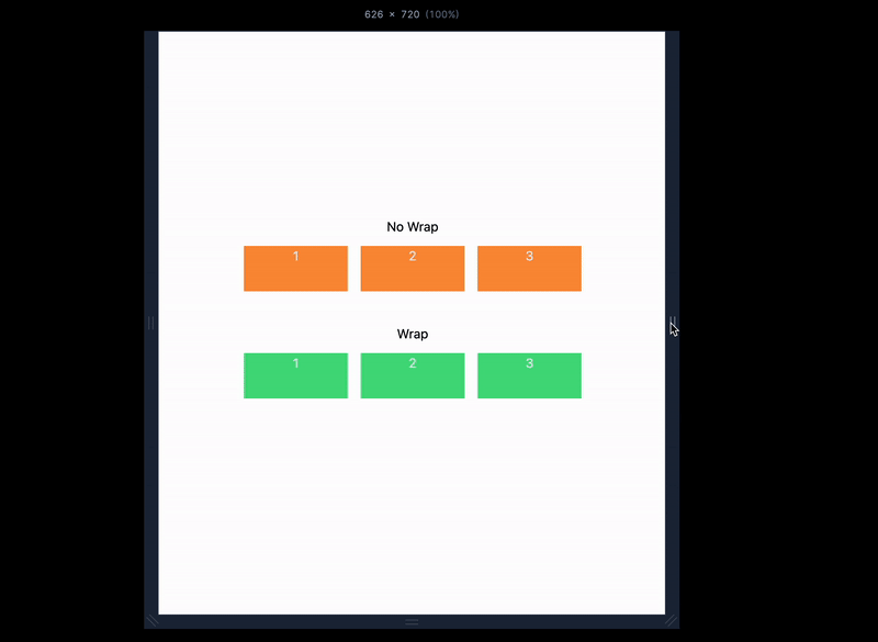
Source code:
<div class="flex h-screen flex-col items-center justify-center px-5">
  <h2>No Wrap</h2>
  <div class="flex justify-center gap-4 mt-3 mb-10">
    <div class="h-14 w-32 bg-orange-400 text-center text-slate-200">1</div>
    <div class="h-14 w-32 bg-orange-400 text-center text-slate-200">2</div>
    <div class="h-14 w-32 bg-orange-400 text-center text-slate-200">3</div>
  </div>

  <h2>Wrap</h2>
  <div class="flex flex-wrap justify-center gap-4 mt-3 mb-10">
    <div class="h-14 w-32 bg-green-400 text-center text-slate-200">1</div>
    <div class="h-14 w-32 bg-green-400 text-center text-slate-200">2</div>
    <div class="h-14 w-32 bg-green-400 text-center text-slate-200">3</div>
  </div>
</div>
Flex Order
The flex order is useful for specifying the ordering of flex items. For example; We can use the order-3 to position the first item/child to be on the third position order as shown below.
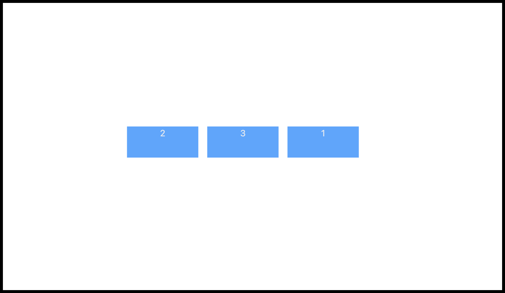
The tailwind order property ranges from 0 to 12.
Source code:
<div class="flex justify-center gap-4">
  <div class="h-14 w-32 bg-blue-400 text-center text-slate-200 order-3">1</div>
  <div class="h-14 w-32 bg-blue-400 text-center text-slate-200">2</div>
  <div class="h-14 w-32 bg-blue-400 text-center text-slate-200">3</div>
</div>
Justify Content
The flex justify-content property is useful for specifying where the flex item should be positioned along the parent main axis. Below are visuals of how the justify-content property and values work in Tailwind CSS.
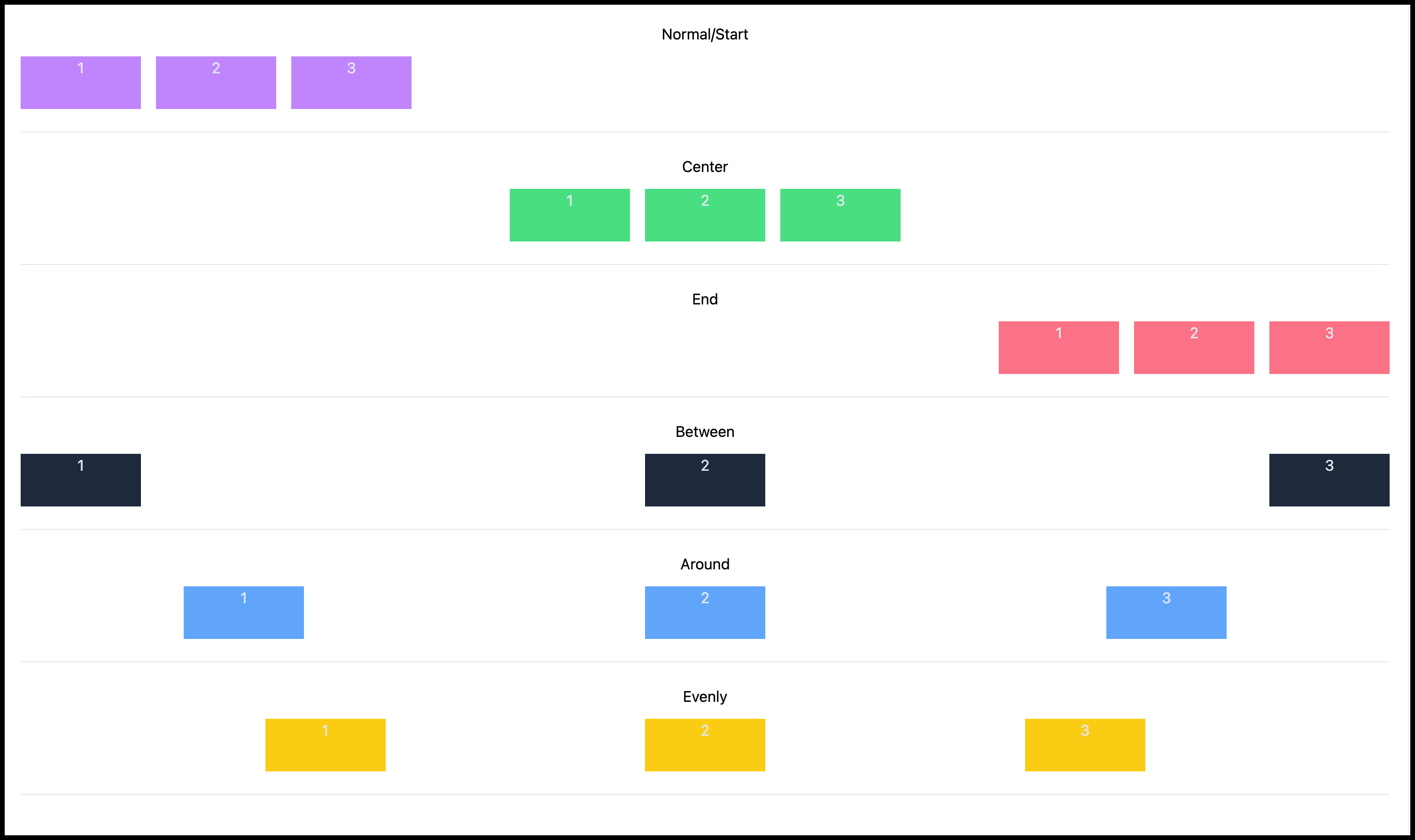
Source code:
<div class="flex flex-col text-center justify-center p-5">
  <h2>Normal/Start</h2>
  <div class="mb-6 mt-3 flex w-full justify-normal gap-4 border-b border-slate-200 pb-6">
    <div class="h-14 w-32 bg-purple-400 text-center text-slate-200">1</div>
    <div class="h-14 w-32 bg-purple-400 text-center text-slate-200">2</div>
    <div class="h-14 w-32 bg-purple-400 text-center text-slate-200">3</div>
  </div>

  <h2>Center</h2>
  <div class="mb-6 mt-3 flex w-full justify-center gap-4 border-b border-slate-200 pb-6">
    <div class="h-14 w-32 bg-green-400 text-center text-slate-200">1</div>
    <div class="h-14 w-32 bg-green-400 text-center text-slate-200">2</div>
    <div class="h-14 w-32 bg-green-400 text-center text-slate-200">3</div>
  </div>

  <h2>End</h2>
  <div class="mb-6 mt-3 flex w-full justify-end gap-4 border-b border-slate-200 pb-6">
    <div class="h-14 w-32 bg-rose-400 text-center text-slate-200">1</div>
    <div class="h-14 w-32 bg-rose-400 text-center text-slate-200">2</div>
    <div class="h-14 w-32 bg-rose-400 text-center text-slate-200">3</div>
  </div>

  <h2>Between</h2>
  <div class="mb-6 mt-3 flex w-full justify-between gap-4 border-b border-slate-200 pb-6">
    <div class="h-14 w-32 bg-slate-800 text-center text-slate-200">1</div>
    <div class="h-14 w-32 bg-slate-800 text-center text-slate-200">2</div>
    <div class="h-14 w-32 bg-slate-800 text-center text-slate-200">3</div>
  </div>

  <h2>Around</h2>
  <div class="mb-6 mt-3 flex w-full justify-around gap-4 border-b border-slate-200 pb-6">
    <div class="h-14 w-32 bg-blue-400 text-center text-slate-200">1</div>
    <div class="h-14 w-32 bg-blue-400 text-center text-slate-200">2</div>
    <div class="h-14 w-32 bg-blue-400 text-center text-slate-200">3</div>
  </div>

  <h2>Evenly</h2>
  <div class="mb-6 mt-3 flex w-full justify-evenly gap-4 border-b border-slate-200 pb-6">
    <div class="h-14 w-32 bg-yellow-400 text-center text-slate-200">1</div>
    <div class="h-14 w-32 bg-yellow-400 text-center text-slate-200">2</div>
    <div class="h-14 w-32 bg-yellow-400 text-center text-slate-200">3</div>
  </div>
</div>
Align Items
The flex align-items property is useful for specifying where the flex item should be positioned along the parent cross-axis. Below are visuals of how the align-items property and values work in Tailwind CSS.
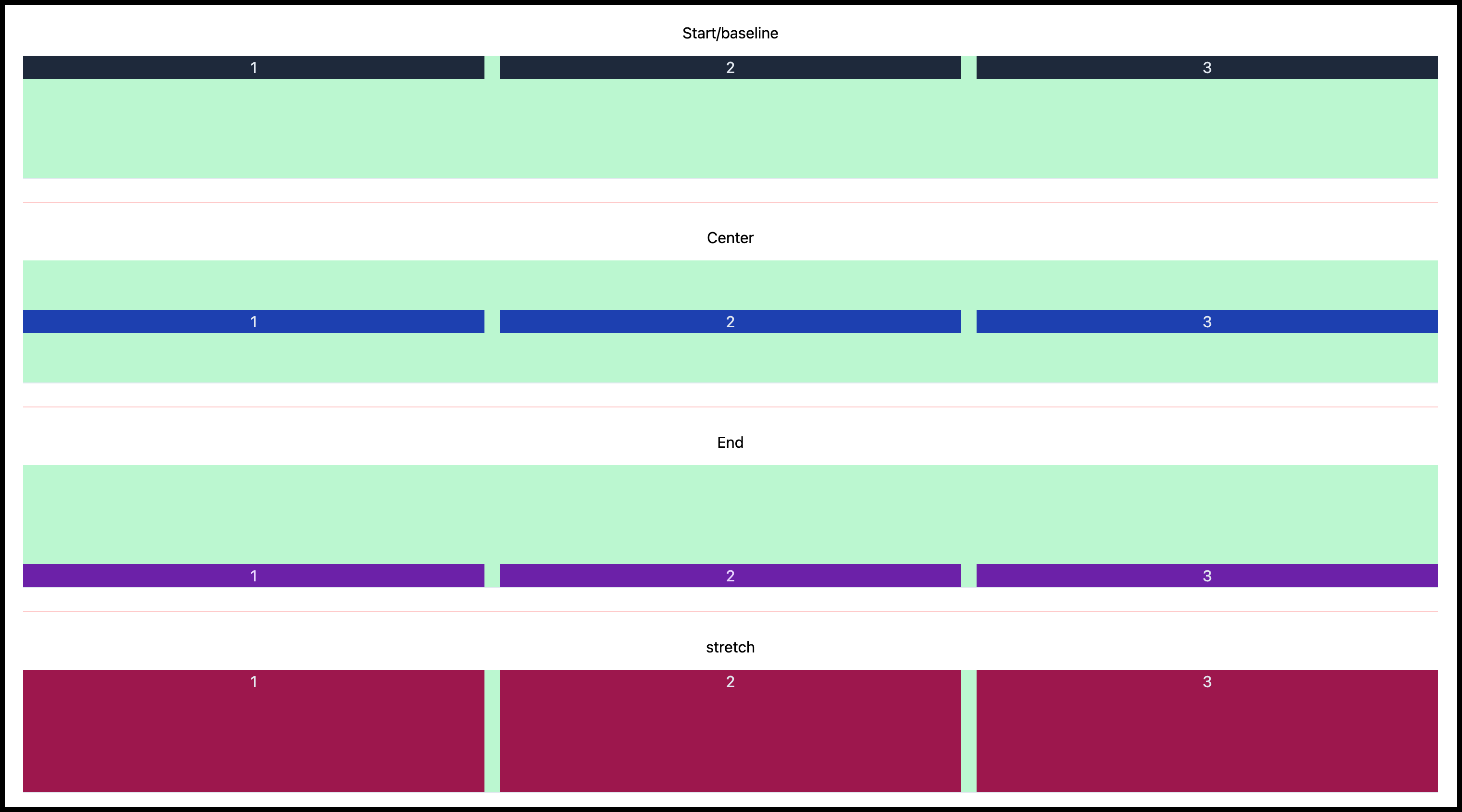
Source code:
<div class="flex flex-col justify-center p-5 text-center">
  <h2>Start/baseline</h2>
  <div class="mt-3 flex h-32 w-full items-start gap-4 border-b border-slate-200 bg-green-200">
    <div class="w-full bg-slate-800 text-center text-slate-200">1</div>
    <div class="w-full bg-slate-800 text-center text-slate-200">2</div>
    <div class="w-full bg-slate-800 text-center text-slate-200">3</div>
  </div>

  <hr class="my-6 border-t border-red-200" />

  <h2>Center</h2>
  <div class="mt-3 flex h-32 w-full items-center gap-4 border-b border-slate-200 bg-green-200">
    <div class="w-full bg-blue-800 text-center text-slate-200">1</div>
    <div class="w-full bg-blue-800 text-center text-slate-200">2</div>
    <div class="w-full bg-blue-800 text-center text-slate-200">3</div>
  </div>

  <hr class="my-6 border-t border-red-200" />

  <h2>End</h2>
  <div class="mt-3 flex h-32 w-full items-end gap-4 border-b border-slate-200 bg-green-200">
    <div class="w-full bg-purple-800 text-center text-purple-200">1</div>
    <div class="w-full bg-purple-800 text-center text-purple-200">2</div>
    <div class="w-full bg-purple-800 text-center text-slate-200">3</div>
  </div>

  <hr class="my-6 border-t border-red-200" />

  <h2>stretch</h2>
  <div class="mt-3 flex h-32 w-full items-stretch gap-4 border-b border-slate-200 bg-green-200">
    <div class="bg-pink-800 w-full text-center text-slate-200">1</div>
    <div class="bg-pink-800 w-full text-center text-slate-200">2</div>
    <div class="bg-pink-800 w-full text-center text-slate-200">3</div>
  </div>
</div>
Align Self
Align self is useful for specifying the position of each item individually instead of using the align-item property.
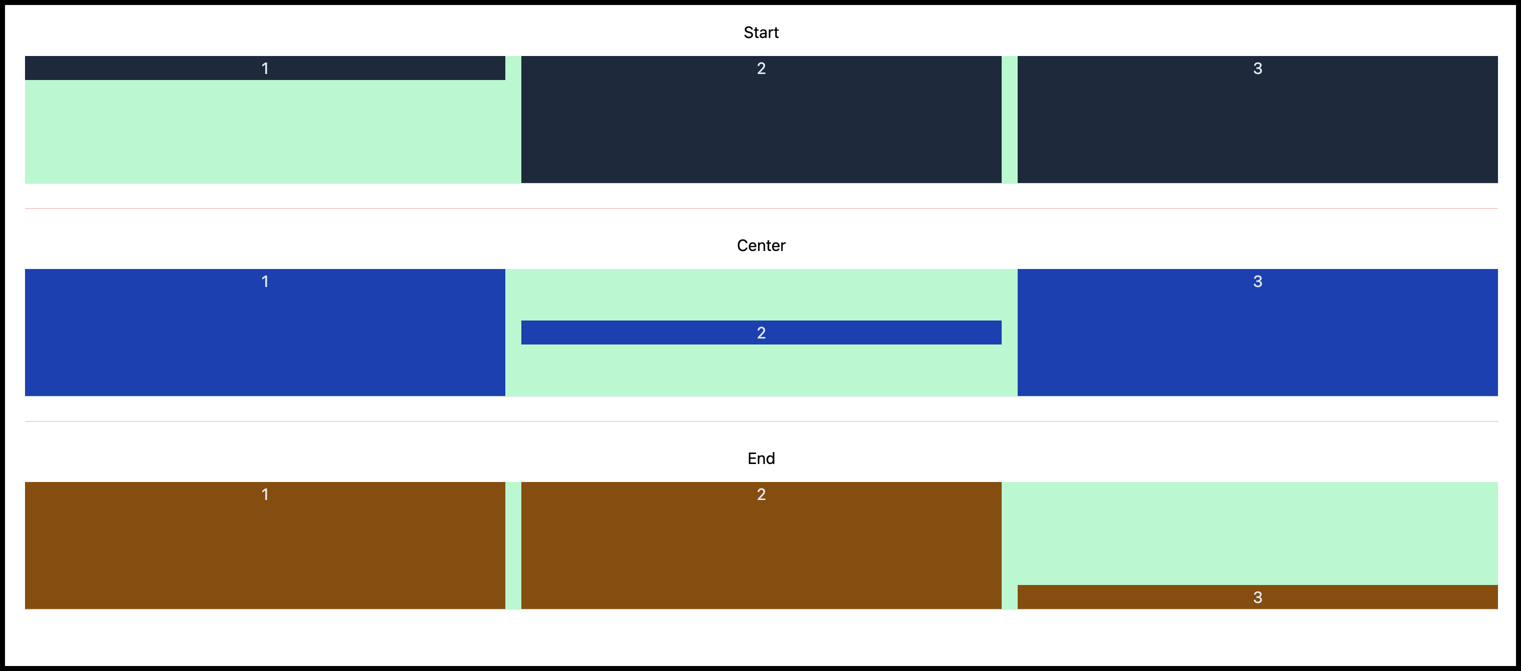
Source code:
<div class="flex flex-col justify-center p-5 text-center">
  <h2>Start</h2>
  <div class="mt-3 flex h-32 w-full gap-4 border-b border-slate-200 bg-green-200">
    <div class="w-full self-start bg-slate-800 text-center text-slate-200">1</div>
    <div class="w-full bg-slate-800 text-center text-slate-200">2</div>
    <div class="w-full bg-slate-800 text-center text-slate-200">3</div>
  </div>

  <hr class="my-6 border-t border-red-200" />

  <h2>Center</h2>
  <div class="mt-3 flex h-32 w-full gap-4 border-b border-slate-200 bg-green-200">
    <div class="w-full bg-blue-800 text-center text-slate-200">1</div>
    <div class="w-full self-center bg-blue-800 text-center text-slate-200">2</div>
    <div class="w-full bg-blue-800 text-center text-slate-200">3</div>
  </div>

  <hr class="my-6 border-t border-red-200" />

  <h2>End</h2>
  <div class="mt-3 flex h-32 w-full gap-4 border-b border-slate-200 bg-green-200">
    <div class="w-full bg-yellow-800 text-center text-slate-200">1</div>
    <div class="w-full bg-yellow-800 text-center text-slate-200">2</div>
    <div class="w-full self-end bg-yellow-800 text-center text-slate-200">3</div>
  </div>
</div>
Wrapping up on Tailwind Flex basics
In conclusion, Tailwind CSS Flexbox offers a powerful and versatile solution for creating responsive and visually appealing layouts. In this article, we explored what Tailwind Flex property is and its commonly used properties such as justify-content, align-content, align-items, gap, etc.
By understanding and utilizing utility classes, flex directions, spacing, alignment, and ordering, you can create visually appealing and functional designs with ease.
If you want to learn more about Flex, you can watch the video tutorial below.
Be the first to know about our launch!
Sign up to be notified when Purecode launches in October 2023. Generate thousands of responsive custom-styled HTML, CSS, Tailwind, and JS components with our AI assistant and customize them to match your brand.


