Building the World Simplest Hamburger with HTML and CSS
I think I figured out the easiest way to build those hamburgers now
We all know that hamburger menus are one of the most common components we find on modern websites, and building them from scratch is not fun for most front-end developers.
In this article, I will be sharing the world's simplest method of building a hamburger menu with just a few lines of CSS (just two actually).

I stumbled on this solution, during one of my tutorial session, I had a bad network and couldn't load the hamburger icon from font-awesome, and the last thing I want to do is to take the participants through the long procedure of building a hamburger with the Before and After Pseudo-elements approach, then the idea popped up in my head.
Let's get started
This article is split into two sections
The HTML section and
The CSS section
1. The HTML Section
Create a new index.html file and copy-paste the code below inside
<!DOCTYPE html>
<html lang="en">
<head>
    <meta charset="UTF-8">
    <meta http-equiv="X-UA-Compatible" content="IE=edge">
    <meta name="viewport" content="width=device-width, initial-scale=1.0">
    <!-- import css styles -->
    <link rel="stylesheet" href="./assets/main.css">
    <title>World Simplest Hamburger</title>
</head>
<body>
    <!-- navbar section -->
    <nav>
        <!-- brand name -->
        <a href="#" class="brand">Simplest Hamburger</a>
        <!-- World simplest hamburger -->
        <span class="hamburger" onclick="alert('working')">|||</span>
    </nav>
    <!-- end of navbar section -->
</body>
</html>
Save it and run it on your browser, the output should be like below

Explanation:
We created a nav tag that wraps around our brand anchor tag and our hamburger span tag, and inside the hamburger span tag we have three (3) vertical bars (|||) which will serve as our hamburger. Funny right???
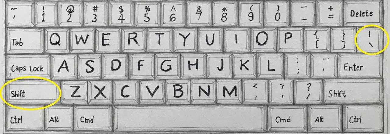
This can be achieved by pressing the shift key + the ` backslash (\) key

2. The CSS Section
We are almost there, create a main.css file and copy-paste the code below.
/* resetting browser default styles */
*{
    padding: 0;
    margin: 0;
    box-sizing: border-box;
}

/* navbar style*/
nav{
    display: flex;
    justify-content: space-between;
    align-items: center;
    padding: 0px 40px;
    background-color: #845EC2;
}

/* navbar brand style */
nav .brand{
    font-size: 30px;
    text-decoration: none;
    color: #F9F871;
}

/* hamburger style */
nav .hamburger{
    /* the tricks */
    position: relative;
    transform: rotate(90deg);

    /* optional */
    font-size: 3rem;
    cursor: pointer;
    padding: 10px 6px;
    font-weight: 900;
    color: #F9F871;
}
/* hamburger hover style */
nav .hamburger:hover {
    color: #FFC75F;
}
Save your main.css file and refresh your browser, you should have a nice hamburger displayed on your screen.

cool right? let me explain what we just did.
Explanation
Let's forget about other styles and focus on the main CSS code that helps us to make up the hamburger (the horizontal bars).
/* hamburger style */
nav .hamburger{
position: relative;
transform: rotate(90deg);
}
We set the hamburger span tag which contains the three (3) vertical bars to be relative to its current position within the navbar tag which is the parent element, then we use the CSS transform to rotate the three (3) vertical bars to 90degree, and that gives us the perfect hamburger shape we wanted.
Conclusion
I am super excited to have figured this method out and I hope you've learned one or two things from building the World's easiest hamburger menu.
Let me know your opinion about this approach and if there is an easier way to build a hamburger menu, kindly share in the comment section below.
Thanks.
